Nuevo mapa mundial
La ONU actualiza el mapa mundial corrigiendo distorsiones y mostrando a España más grande
Anonymous
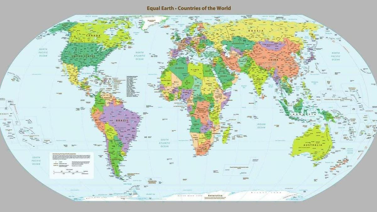
The UN has adopted a new world map that shows countries in their true sizes, revealing a stark difference from the maps most people grew up with. El Correo Gallego reports that Spain now appears significantly larger than it does on traditional maps, while massive distortions in other regions become impossible to ignore.
The traditional map has hidden a major geographic lie for centuries. Greenland appears as large as Africa on standard maps, even though it is actually 14 times smaller than the African continent Información. This distortion affects how billions of people understand the world's true geography.
The Mercator Projection's 300-Year Distortion
Most world maps rely on the Mercator projection, created in 1569. This flat map exaggerates sizes near the poles and shrinks regions near the equator. Greenland balloons to equal Africa's size, while actual equatorial nations shrink dramatically. El Día notes this projection was designed for navigation, not geographic accuracy.
Why the New Map Changes Everything
The UN's new map uses the Gall-Peters projection, which preserves area accuracy. Countries now appear in their true proportions to each other. Africa regains its massive size. Greenland shrinks to realistic dimensions. El Periódico reports that Spain and other mid-latitude regions finally show their genuine scale on the global stage.
A Shift in How We See Global Power
For centuries, traditional maps unconsciously shaped political perception. Large northern nations looked dominant. Equatorial and African nations appeared smaller and less significant. Diario de Ibiza explains that the new map challenges this visual bias, helping people understand that Africa contains 54 countries and over 1.3 billion people—far more than the old map suggested.
Sentiment
NeutralNEGATIVENEUTRALPOSITIVE
Publishers
13
Articles
0
Reach
13
A
AnonymousAuthor


